Home · Product · Period Comparison

Every account, every metric, every trend — on a single screen.

See how every Google Ads account in your portfolio is performing this month vs. last month, vs. last year, vs. any custom date range you pick. Cost, clicks, impressions, CPC, ROAS, cost-per-conv, conversions — all with directional change indicators. No drill-downs needed.

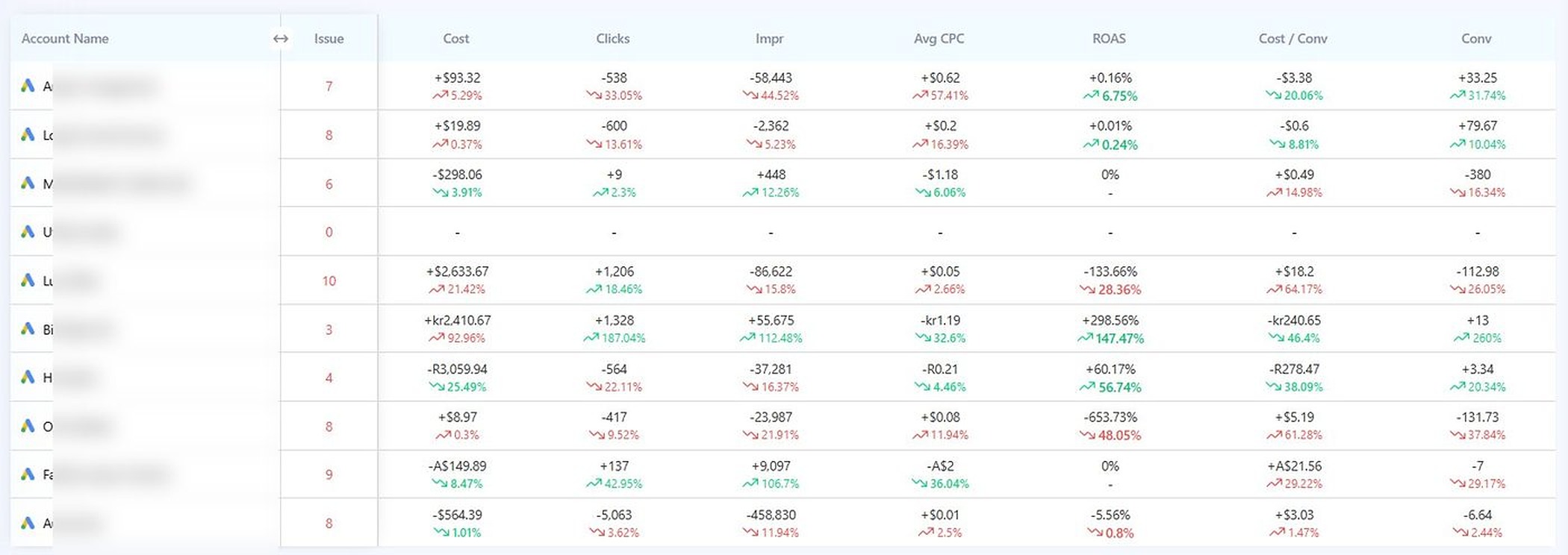
The view that replaces 30 spreadsheets

Trend deltas for every account in your portfolio.

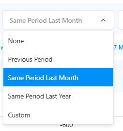
No more pulling reports for each client. Switch periods at the top, the entire grid recomputes. Hover (or tap) to zoom in on the screenshot below.

Featured view
Multi-account period comparison

9 accounts. 7 metrics. 63 trend signals. One screen.

Cost, clicks, impressions, average CPC, ROAS, cost-per-conversion, total conversions — each one with the absolute change and percentage delta vs. your selected period. Green when winning, red when losing. Sort by any column.

Adtunez period comparison dashboard showing all linked Google Ads accounts with cost, clicks, impressions, CPC, ROAS, cost-per-conversion and conversion deltas vs. previous period in red and green trend indicators
Why this view changes how you work

The Google Ads UI shows one account at a time.
Adtunez shows them all.

To answer "which of my 30 client accounts had a bad week" in Google Ads, you'd open each account, set a comparison period, scan a chart, write down what you saw, then move to the next one. That's 30 tabs, 30 minutes, 30 chances to miss something.

The Adtunez period comparison view loads all of them at once. Cost up 21% on one account, ROAS down 28% on another, conversions up 79 on a third — you see every signal in 30 seconds. The accounts that need attention surface themselves.

  • Up and down indicators on every metric (cost, clicks, impr, CPC, ROAS, cost/conv, conv)
  • Absolute + percentage change shown side-by-side
  • Green/red color coding matched to whether the direction is good or bad for that metric
  • Sort by any column to find the biggest movers fast
Period comparison view showing red and green trend deltas for cost, clicks, impressions, CPC, ROAS, cost-per-conversion, and conversions across nine Google Ads client accounts
Four ways to compare

Pick the period that matches your reporting cadence.

Switch comparison windows from a single dropdown at the top of the dashboard. The whole grid recomputes instantly.

01Previous Period

Compare to the same number of days immediately before. If you're viewing "last 7 days," it compares to the 7 days before that. Useful for week-over-week trend tracking.

02Same Period Last Month

Compare to the same date range one month ago. Mar 1–15 vs Feb 1–15. Catches monthly-cycle issues like billing dates, payday traffic, or month-end pushes.

03Same Period Last Year

Compare to the exact same date range, 12 months ago. The only honest comparison for seasonal businesses — travel, retail, fitness, education. Tells you if growth is real or just a season.

04Custom Range

Pick any two date ranges to compare. Pre vs. post a campaign launch. Before vs. after a budget reallocation. Two specific weeks for a board report. Total flexibility.

In-app

Single dropdown at the top of the dashboard. Click, pick, every metric recomputes.

Period comparison dropdown showing four options: None, Previous Period, Same Period Last Month, Same Period Last Year, Custom
Every metric that matters

Seven trend signals. Per account.

Each metric in the period comparison view is paired with both the absolute change and percentage delta — so spikes that look small in % can still surface when the dollar move is large (and vice-versa).

$

Cost

Total spend for the period. Up means more invested; pair with conv to see if it paid off. Sudden cost jumps usually signal a stuck budget pacing issue or a runaway PMax campaign.

Clicks

Total clicks. Up with cost flat means CPC fell (good). Down with cost up means CPC rose, often a sign of weakening Quality Score or bid creep.

Impressions

Auction reach. Big drops can mean budget caps, disapproved ads, or losing impression share to a new competitor.

µ

Average CPC

Cost per click. Down usually means Quality Score improved or competition softened. Up the opposite.

×

ROAS

Return on ad spend. The most reliable single signal that an account is winning or losing. A 28% drop in ROAS across multiple accounts in the same week is the kind of thing this view exists to surface.

÷

Cost / Conv

Effective CPA. Pair with ROAS for the full picture. Rising CPA on rising ROAS = customers buying more per visit. Rising CPA on flat ROAS = pricing pressure.

Conversions

Total converting actions. The bottom-line metric. Always read alongside the other six — a 79-conv jump on flat ROAS means every other lever is working.

Use cases

Three things this view replaces for you.

01

Monday-morning portfolio review

Open Adtunez, set comparison to "Same Period Last Month," and 30 client accounts review themselves in 60 seconds. The ones that moved show up red or green. The ones to call about, you call.

02

YoY board reports

Set comparison to "Same Period Last Year." Take a screenshot. That's your portfolio-level board slide. Done. Especially powerful for seasonal businesses where MoM hides the real story.

03

A/B campaign analysis

Pick two custom date ranges — before launch and after. Compare. Every metric, every account, side by side. The kind of analysis that used to take a junior analyst half a day, done in two clicks.

See your portfolio's trends in one screen.

The period comparison view is included on every Adtunez plan. Run a free audit or start a 15-day trial — your first comparison view loads within 10 minutes of connecting.